DEADLY CUSTOMS
Project scope: Logo design, business stationery.
THE CLIENT
Due to his many years of experience working in car dealerships as a mechanic, Sean quickly became everyone’s go-to handyman for help installing their car modifications. Sean’s abiltity to tinker his way through any complex mechanical problem lead to a growing base of friends & clients who would return to him for regular maintenance and servicing.
Sean was becoming increasingly aware of the problem with his logo design and hoped to build more trust in his community by strengthening his online presence. He approached me at a networking event expressing his interest in working with me to design a new logo.


Sean’s instagram story marketing and previous logo design. Cooked up in Canva- not a bad DIY!
Sean wanted to work on cool cars.
While conversing with Sean over future goals for his business, I discovered that he was determined to position his workshop as a place that car enthusiasts could trust their pride and joy’s would be in good hands.

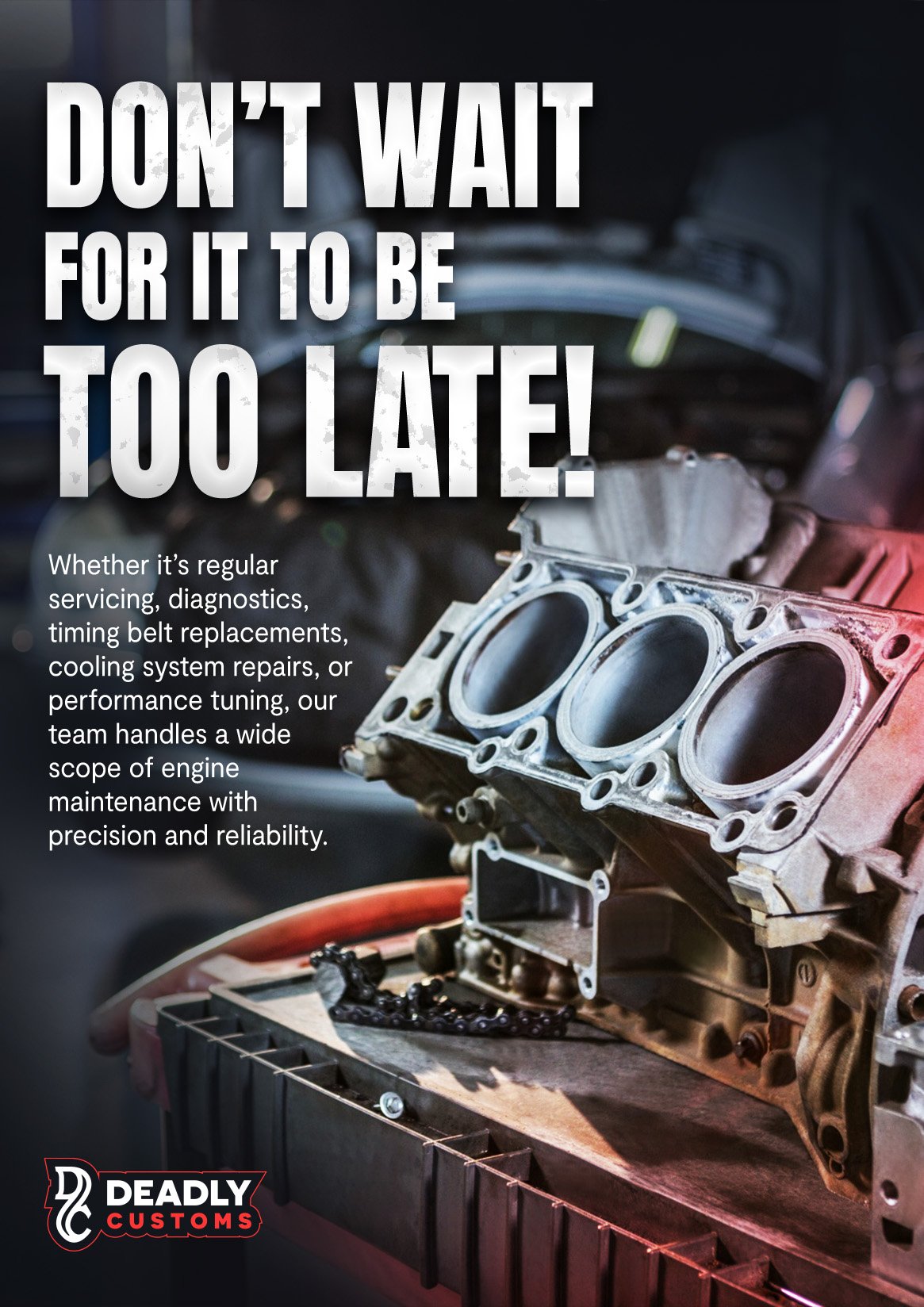
Through conducting research into the performance shop landscape, I noticed a common theme in these shop’s visual identities. Striking red and black colour schemes and loud, bold typography would allow Sean to fit right in.

Initial Concepts
The magic took place in my sketchbook, where I fleshed out all possible directions the logomark could take with the given personality and brand name.
My aim was to capture the edgy personality Sean had incorporated into his current branding alligned to the street racing culture in Sydney.
Initial concepts saw the development of a D+C monogram that embodied this dark personality and premium service.
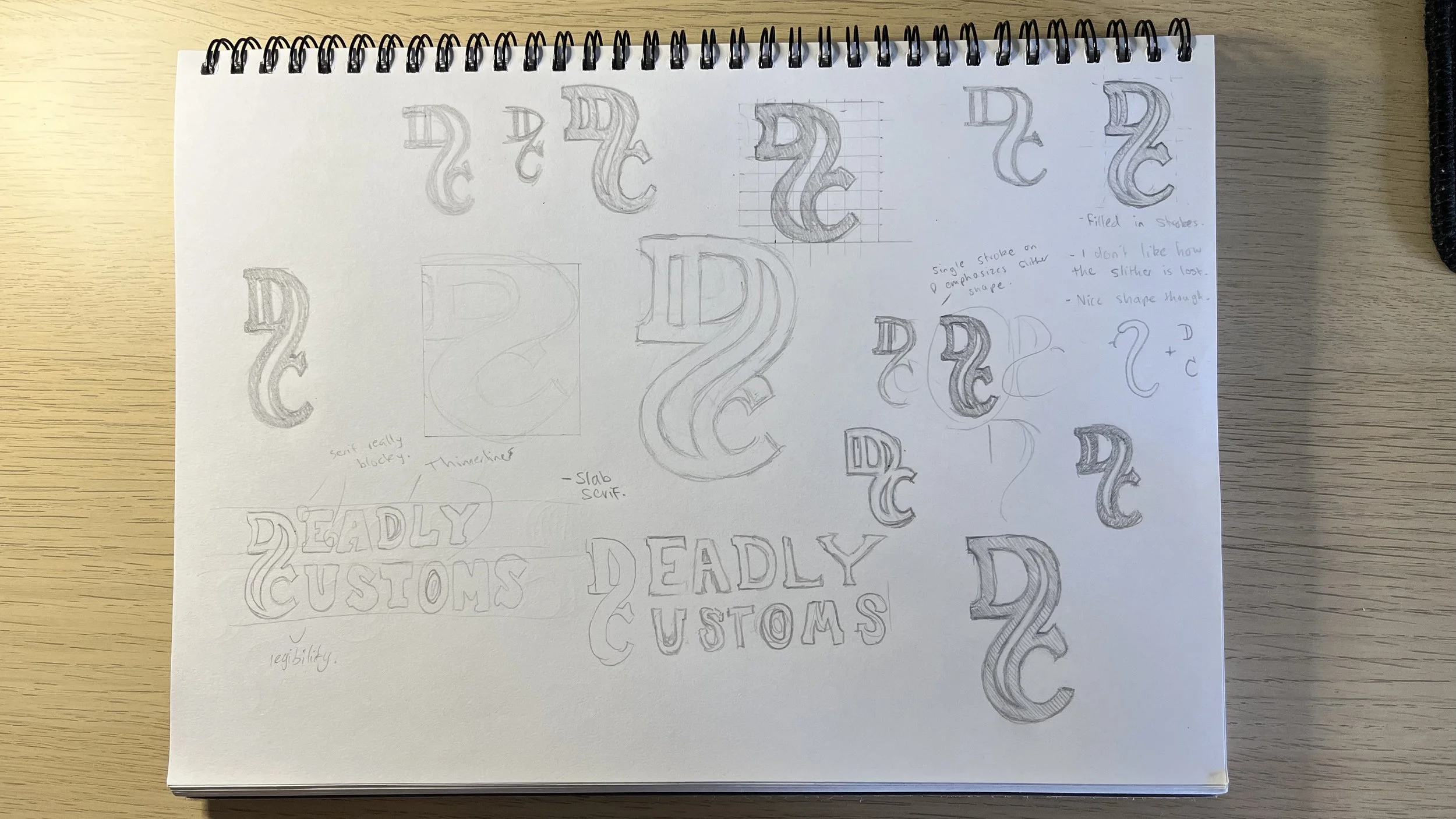


A few images of sketchbook drawings + the three initial concepts presented to Sean.
CLIENT TESTIMONIAL
“Working with Brad was pretty impactful. He took the time to understand my vision, his creativity and attention to detail made the process sweet and smooth. It literally felt like he was just as invested in my business as I was.”
Sean Nancarrow- Automotive Mechanic and Business Owner

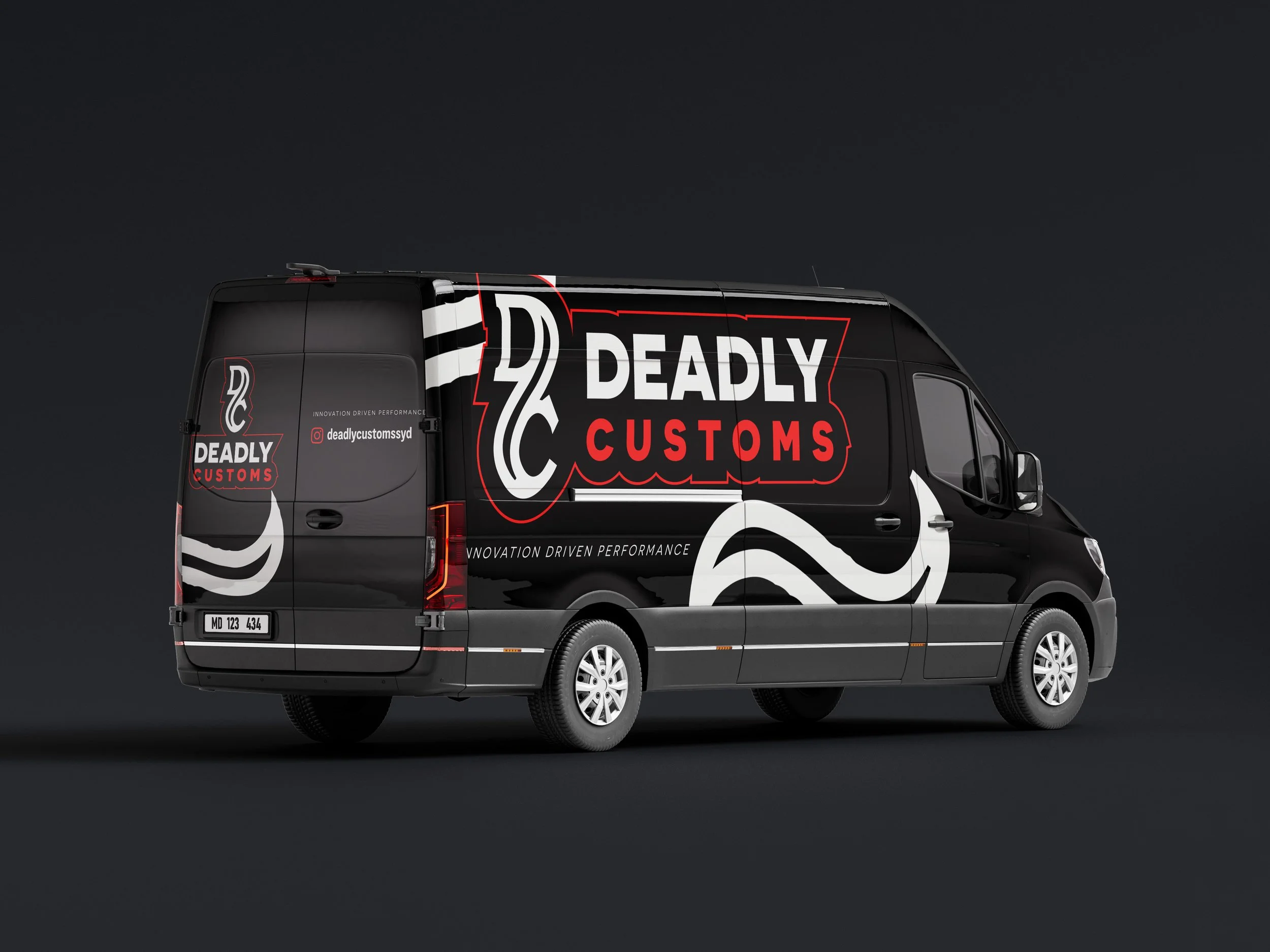
THE RESULT
Through further development of the presented ideas, we landed on a final logo design- a monogram that captures an edgy personality paired with a simple bold sans-serif typeface.


For the logo’s use on white backgrounds, a strong thick stroke-outline is applied - a graphic element inspired by popular motorsport logos.
sEE THE VIDEO HERE!