PEak State
Project Scope: Logo Design
The project
Josh was looking to invest in a logo design for PEAK STATE, his ultimate online coaching and self improvement program.
The program was directed towards men who are actively looking to develop in most areas of life - including their health, wealth, and relationships.


But Josh didn’t want to be generic.
He wanted to ensure his program was differentiated from the highly competitive online coaching space.
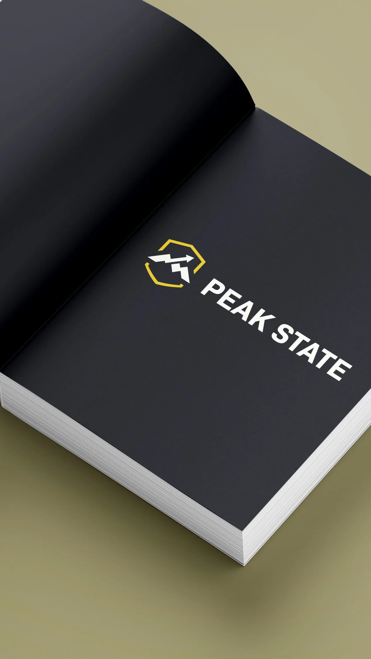
This crucial part of his brand identity allowed him to build a huge amount of trust and credibility with his audience with an improved, and more established appearance.
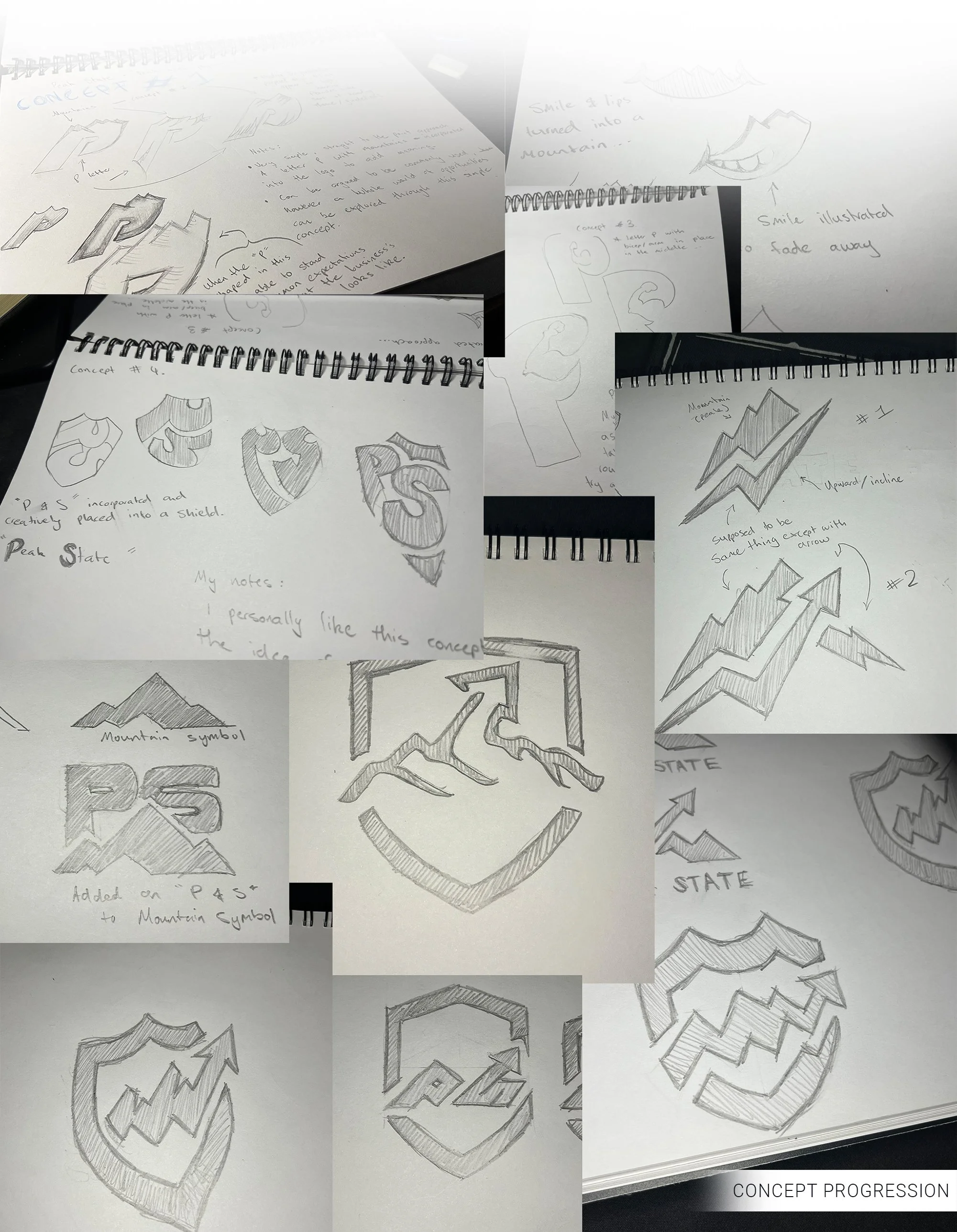
The logo uses the shape of a shield to symbolise trust and belief, and an arrow soaring over a mountain in the centre of the shield communicates the success his many clients have seen.
Josh has since successfully published his own book alongside the launch of an online community 'The Bettermen Brotherhood'.

The Peak State logo has been recently revised since it’s completion in 2023. Below shows the old logo on the left and revised version on the right.


Josh Smart - PEAK STATE
“I honestly couldn’t be happier with the logo. Brad was able to bring my idea to life in a way that far exceeded my expectations. He guided me through the creative process and we landed on a design that i loved. He’s a seriously underrated designer.”